shutupbanks
Castellan
 There’s a horror movie called Alien? That’s really offensive. No wonder everyone keeps invading you.
Likes: 5,677 
|
Post by shutupbanks on Oct 30, 2022 1:05:25 GMT
Because a big part of watching Who for me has always been that the show has changed as time has gone on and it has only ever looked backwards/inwards when it is celebrating itself (anniversaries), or continuing a story from the past. Making a past Doctor’s return for a set of episodes a focus and then cementing it with the return of the logo feels disrespectful to the actors and producers who have worked on it since Tennant was the Doctor, particularly Whittaker and Chibnall because it feels like a slap in the face to what they have achieved to go back to what was “popular” straight away after their tenure. It feels manipulative and cynical to do this, even for an anniversary. I will be happy to be proved wrong, and I suspect I will because RTD usually keeps something up his sleeve, but my initial reaction is one of concern. I’m also wary of the deal with Disney due to concerns I have raised elsewhere, namely a) needing a subscription to watch our show is not something I’m happy about, b) my concerns about future dvd releases and c) Disney may only want streaming rights but they have form on interference with products that disagree with them politically. Tennant is only returning for RTDs trio of anniversary specials. As for other points a) I understand this but it happens to us in the UK all the time with shows imported from USA etc. b) this is a streaming deal not sure how it impacts on dvd sales. c) if they only have streaming rights they can't interfere in the product, in this case Doctor Who. We’ll find out in November next year. I’m not going to bore the other members by continuing a circular discussion. I’m ok with being wrong about speculations on a tv show but I’ve also seen enough things I was a fan of go bad because they became so popular that they “had” to be interfered with to make them “better.” I get that Tennant is coming back but he really doesn’t have to be the lead to my way of thinking: it suggests that the producers don’t have enough faith in Gatwa as a lead to carry the show on his own. Coming straight after the first female lead, I just have some concerns. |
|
lidar2
Castellan
You know, now that you mention it, I actually do rather like Attack of the Cybermen ...
Likes: 5,813
|
Post by lidar2 on Nov 7, 2022 10:10:50 GMT
So, when we get to the Moffatt 2 era will the neon logo come back?
|
|
Deleted
Deleted Member
Likes:
|
Post by Deleted on Nov 9, 2022 9:07:08 GMT
I quite like the half crescent version of the "new" logo too. A new BBC Books original audio 12th Doc story..with Maureen O'Brien reading...and that logo. Woulda all seemed a bit odd till recently!  Awful cover though apart from that...a dog's dinner. But I like the logo cutdown. 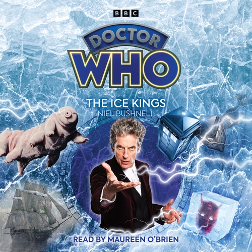 |
|
shutupbanks
Castellan
There’s a horror movie called Alien? That’s really offensive. No wonder everyone keeps invading you.
Likes: 5,677
|
Post by shutupbanks on Nov 9, 2022 9:44:34 GMT
I quite like the half crescent version of the "new" logo too. A new BBC Books original audio 12th Doc story..with Maureen O'Brien reading...and that logo. Woulda all seemed a bit odd till recently! What the hell is going on with that cover? Work experience kid? |
|
|
|
Post by timleschild on Nov 9, 2022 10:00:57 GMT
I quite like the half crescent version of the "new" logo too. A new BBC Books original audio 12th Doc story..with Maureen O'Brien reading...and that logo. Woulda all seemed a bit odd till recently! What the hell is going on with that cover? Work experience kid? It does look very thrown together & the logo looks crap like that. |
|
mbt66
Chancellery Guard
Likes: 3,081
|
Post by mbt66 on Nov 9, 2022 13:56:39 GMT
Have Big Finish made any announcement regarding what logo they will be using going forward?
|
|
|
|
Post by sherlock on Nov 9, 2022 14:01:03 GMT
Have Big Finish made any announcement regarding what logo they will be using going forward? I’d assume they’ll just switch over to current one when opportunity presents, as they did the Chibnall eta. |
|
|
|
Post by grinch on Nov 9, 2022 14:08:17 GMT
I quite like the half crescent version of the "new" logo too. A new BBC Books original audio 12th Doc story..with Maureen O'Brien reading...and that logo. Woulda all seemed a bit odd till recently! What the hell is going on with that cover? Work experience kid? It’s extremely cluttered, isn’t it? |
|
Deleted
Deleted Member
Likes:
|
Post by Deleted on Nov 9, 2022 14:24:19 GMT
Have Big Finish made any announcement regarding what logo they will be using going forward? I’d assume they’ll just switch over to current one when opportunity presents, as they did the Chibnall eta. RTD said there won't be an edict for the merch to switch over when a fan was concerned the blurays would lose the unform look so I wonder if it'll be case by case. BF's old school with a modern twist feel kinda means the new logo is a better fit than most would be though. |
|
|
|
Post by nucleusofswarm on Nov 19, 2022 21:18:23 GMT
Diamond logo, companion Ruby... how's emerald or sapphire going to figure in then?
|
|
|
|
Post by sherlock on Nov 23, 2022 9:14:38 GMT
|
|
boffy
Full Member

Likes: 139
|
Post by boffy on Nov 23, 2022 11:32:34 GMT
Reminds me of this  |
|
|
|
Post by sherlock on Nov 28, 2022 14:02:44 GMT
Horizontal variant of the new logo debuts on the revised Class cover for January-
|
|
|
|
Post by mark687 on Nov 28, 2022 15:14:35 GMT
Horizontal variant of the new logo debuts on the revised Class cover for January- Not keen n this one they're currently using it on the all encompassing BBC Official Who Site www.doctorwho.tv/Regards mark687 |
|
|
|
Post by solarstorm on Nov 29, 2022 13:46:00 GMT
I mean it's fine that they're using it for the 60th anniversary. But I just don't like that they seem to be using it for everything else too. Like I see many people comment that they like the new logo, but I simply can't share that sentiment  . Also I really really don't like how it looks on some of the updated big finish logos. I don't know, it just looks cheap to me in comparison to the old logo and the square format of the logo bothers me for some reason. Maybe, I'm simply way too young to appreciate them reusing an old logo, but I hope they stop using it after the 60th anniversary and just create a brand new logo for the new era... |
|
|
|
Post by mark687 on Dec 2, 2022 15:15:01 GMT
|
|


 . Also I really really don't like how it looks on some of the updated big finish logos. I don't know, it just looks cheap to me in comparison to the old logo and the square format of the logo bothers me for some reason. Maybe, I'm simply way too young to appreciate them reusing an old logo, but I hope they stop using it after the 60th anniversary and just create a brand new logo for the new era...